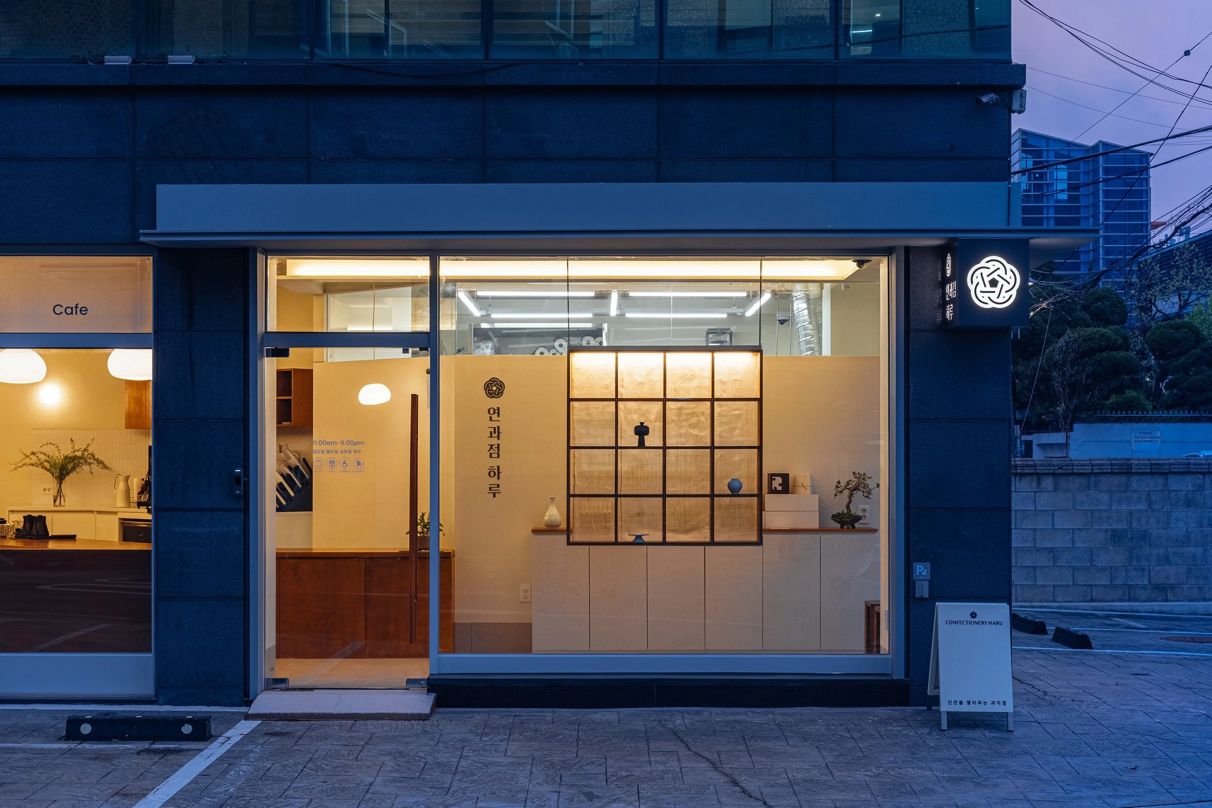
CONFECTIONERY HARU
연과점 하루
Brand Identity and Print Collateral
Identity system for a Seoul-based confectionery brand.
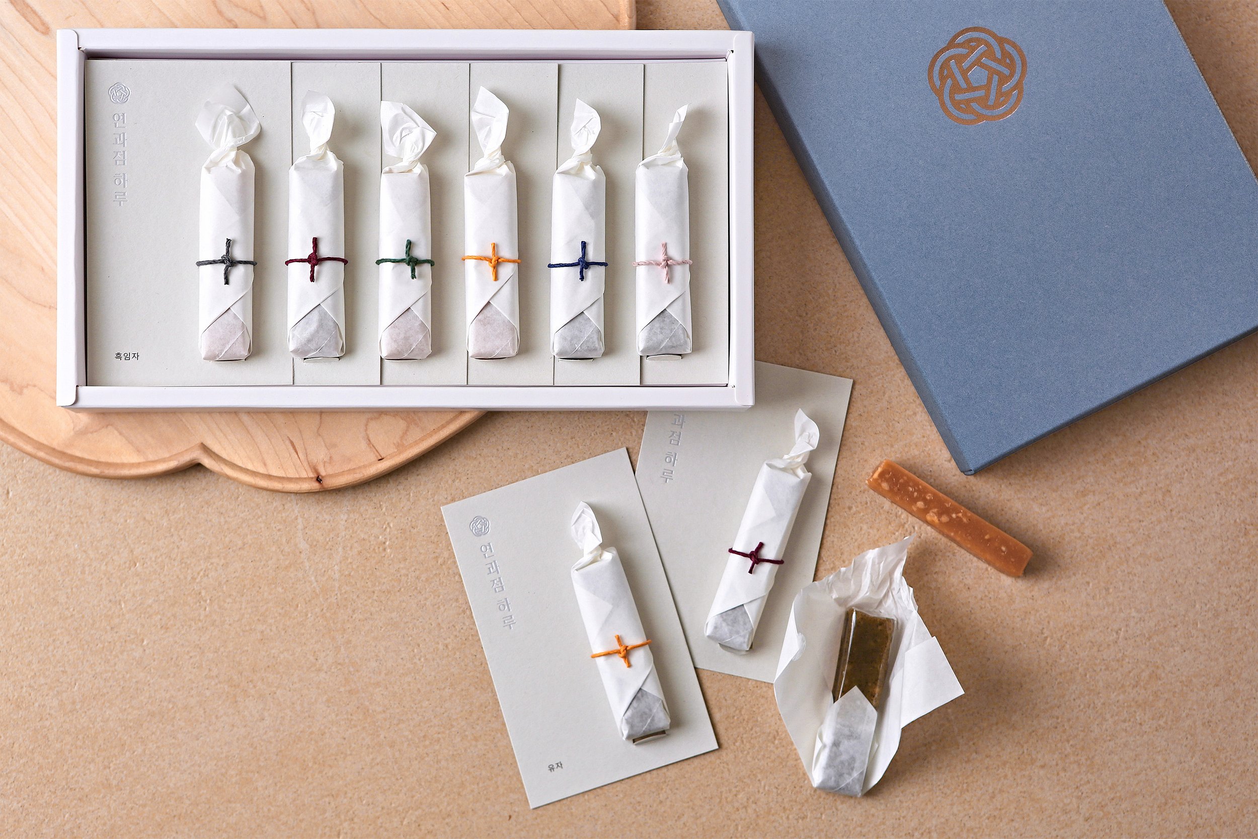
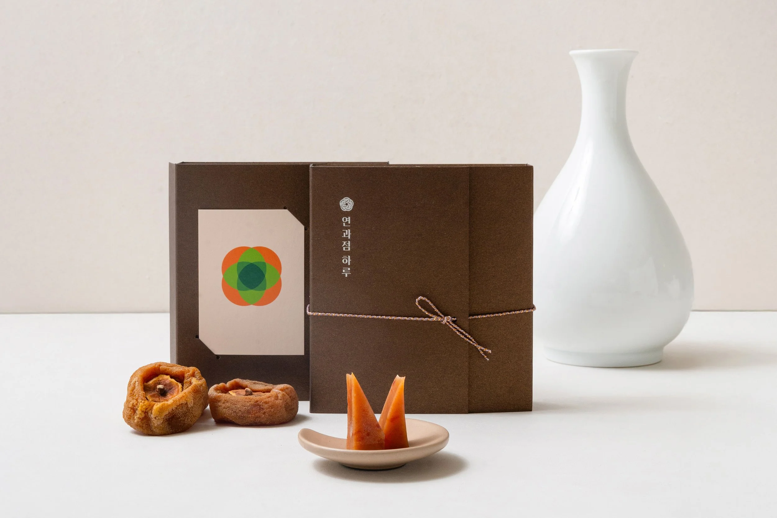
Confectionery Haru specializes in Yeon-gwa (연과 軟菓) — a coined term for caramels inspired by traditional Korean flavors and ingredients.
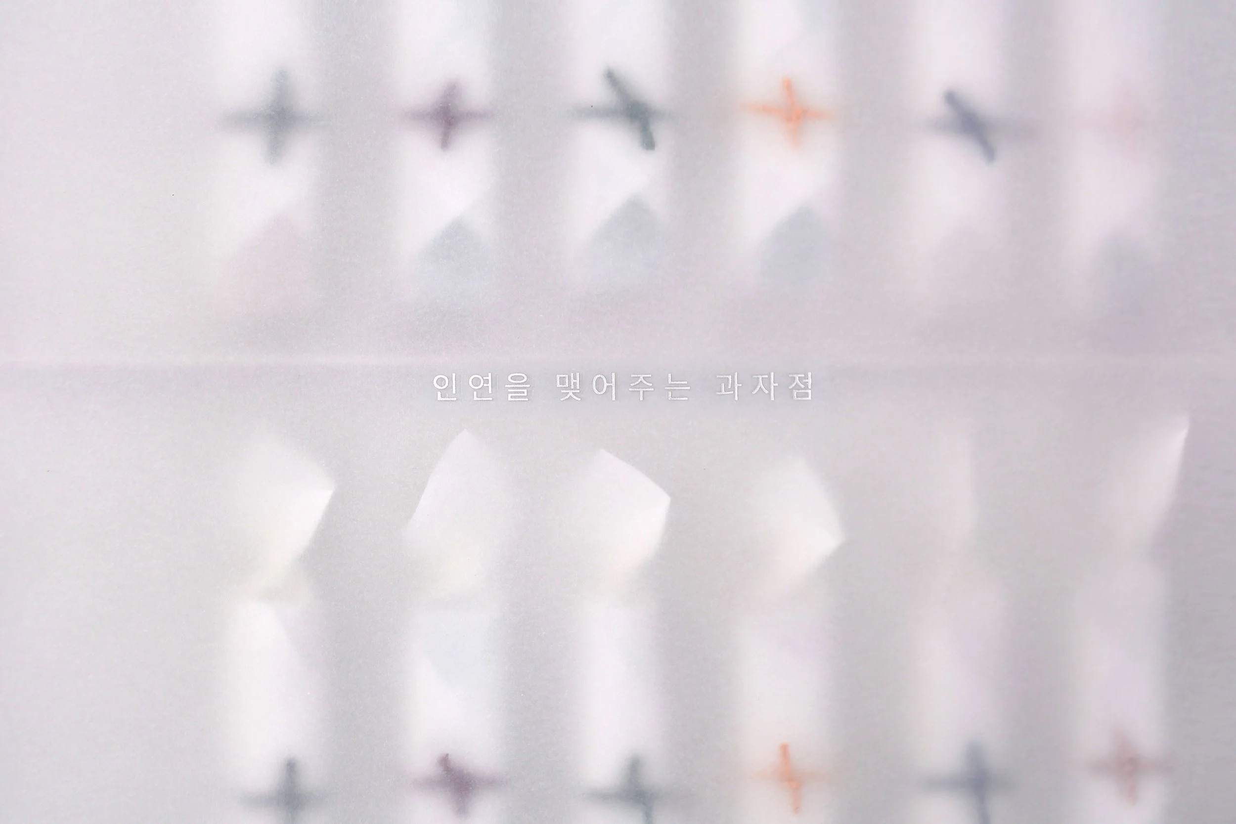
The brand identity draws from Mae-dup (매듭), a traditional Korean knot made of braided silk strands that are looped and intertwined to represent continuity.
This continuous form symbolizes connection, longevity, and the enduring spirit of Korean culture — echoing the brand’s core values of Jeong (정 情, emotional warmth) and Inyeon (인연 因緣, human connection).